ECU website getting a new look in 2012

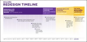
A timeline posted on the redesign blog indicates a plan for implementation of the new design. Click on the photo for a larger image. (Contributed photos)
It was time for a facelift – for the East Carolina University homepage.
Since last fall, the 11 members of the campus Web working group have been planning the redesign for a web site that has 500,000 visits each month and is the “front porch” to the university’s 110,000 individual pages. During the academic year, more than 3 million visitors check out www.ecu.edu with more than 80 percent of that web traffic coming directly to the website. The rest of the traffic comes from search engines and referring websites.
The last major redesign of the ECU homepage was in 2004. “This redesign will bring about a big change,” said Bob Dry, senior web designer in University Marketing & Publications and a member of the working group. “We will be able to bring a lot of new features to the website and give the site a facelift.”
One of the biggest changes in the redesign that regular visitors to www.ecu.edu will notice is that the page will be wider: 770 to 960 pixels in width. This will allow for more content on the page, Dry said, with larger images and font type.
The designers plan to release a full-size mock-up of the redesign in September. The design is still a work in progress with small adjustments being made. The working group doesn’t want users tied to particular features, as the design is being tweaked, Dry said.
ECU has done its web redesign in-house saving the university money, Dry said. In comparison, some other UNC-system schools have used consultants.
Dry said the redesign includes a number of changes that will help the average users, including:
- Having the most recent campus news readily available,
- A new level of personalization for the website through MyLinks,
- Links to social media sites through the ECU website.
In addition, the university has a YouTube channel, is launching an official ECU Facebook page in September, and has an iTunes account for sharing lectures and concerts.
“We haven’t before highlighted social media sites on our page like we will with this redesign,” Dry said.

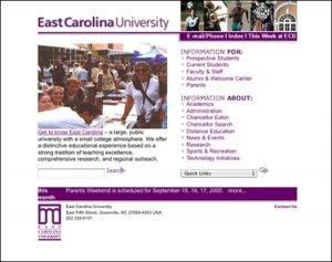
The ECU web page redesign will include changes in keeping with constantly evolving best practices in web design. This August 2000 screenshot shows how the ECU home page appeared a little more than 10 years ago.
Faculty, staff and students, even potential students, will be able to personalize their MyLinks area, which will house bookmarks for a user’s favorite and most used ECU pages, such as Blackboard, Piratemail, and OneStop; the latter will be renamed in the near future as well. In September, the Web working group will launch a beta, or test, site of the redesign and begin running content simultaneously through the current site and the new site to test it.
“During the fall semester, we’ll take feedback from the university community and work out bugs and kinks. We also want to see how the new site handles the traffic load,” Dry said. “In January, the old homepage will come down and the new site will go up.”
Not just the homepage will look different. Individual college, division and office pages will be revamped through changes to the Commonspot templates used to build individual pages.
In 2004, the university began using Commonspot for content management. Today, 95 percent of the university pages are in Commonspot. Dry said having a central content management system allows the university’s webpages to have a similar, consistent look.
When the new homepage is up and running, new Commonspot templates will be available for users to begin updating their individual pages, Dry said. For advanced Commonspot users, there will be blank base templates on which they can build their content. For users who prefer to have templates to chose from and fill in, there will be 10 themed templates reflecting the new university website look.
“Using Commonspot allows the university to have a uniform brand and is easier for visitors to navigate, it provides consistence for visitors, and it saves money because we have centralized server bank and staff,” he said.
Like ECU, the University of North Carolina Wilmington redesigned their website using in-house resources.
Mark Hurt, director of marketing and issues management at the University of North Carolina Wilmington, led the school’s web team in the redesign, which launched across all UNCW webpages in January.
“You get to the point where you have to come into the 21st century,” he said. “The expectation is there. I need something that says we’re current. Seventeen-year-olds are looking at our site. If my website sounds, looks, or feels dated, then it’s counterproductive to my message about training people for the next generation.
“If we are to be the thought leaders in education and business and we have a website that my grandmother uses, then it sends a very mixed message,” Hurt said.
“We decided due to limited resources that we would do the redesign ourselves,” he said.
A graphic designer reworked the pages in conjunction with the university’s IT department. The university launched several smaller sites first before the homepage. The pages for the Cameron School of Business launched in January 2010 with the Watson School of Education following in August.
“This enabled us to get the kinks out before we launched the homepage,” Hurt said.
UNCW uses Adobe Contribute content management system. Like ECU, they used what they already had in place. “With limited resources on the IT side and our side, we asked what are the tools we can use,” he said. And the university community was already familiar with Contribute.
“We need a website that reflects the direction that the university is going,” Hurt said. “Like it or not, it’s the front door to our university.”
Members of the ECU Web working group are as follows:
Mike DeMar, Web designer
Bob Dry, senior Web designer
JoLynne Daughtry, IT Consulting coordinator
Greg Hedgepeth, Web developer
Tony Miller, technology consultant
Chris Schwing, Web designer
Matthew Ballengee, computing consultant
Steven Forehand, project coordinator – senior developer
Brian Hall, technology consultant
Michael Thompson, assistive technology consultant
Meagan Williford, Web editor
The Web team has created a blog chronicling the process of the redesign and answering questions about it: http://blog.ecu.edu/sites/redesign/
# # #